ART 160: VISUAL THINKING
SELF ANALYSIS
4 DRAWINGS


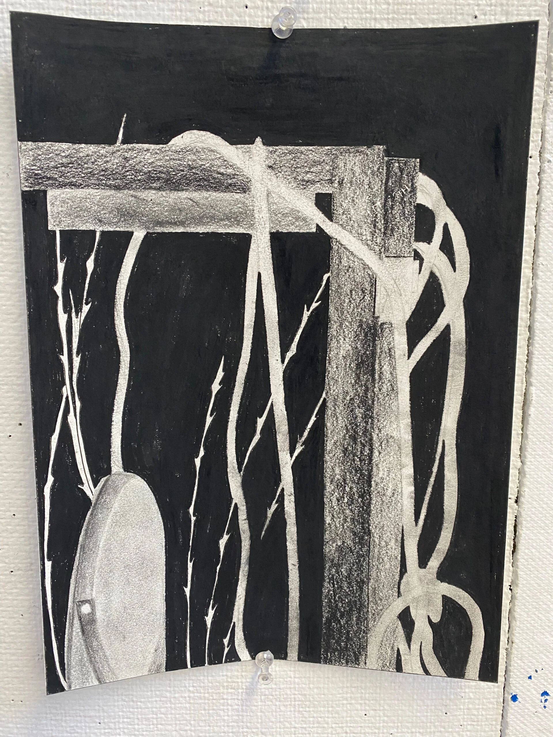
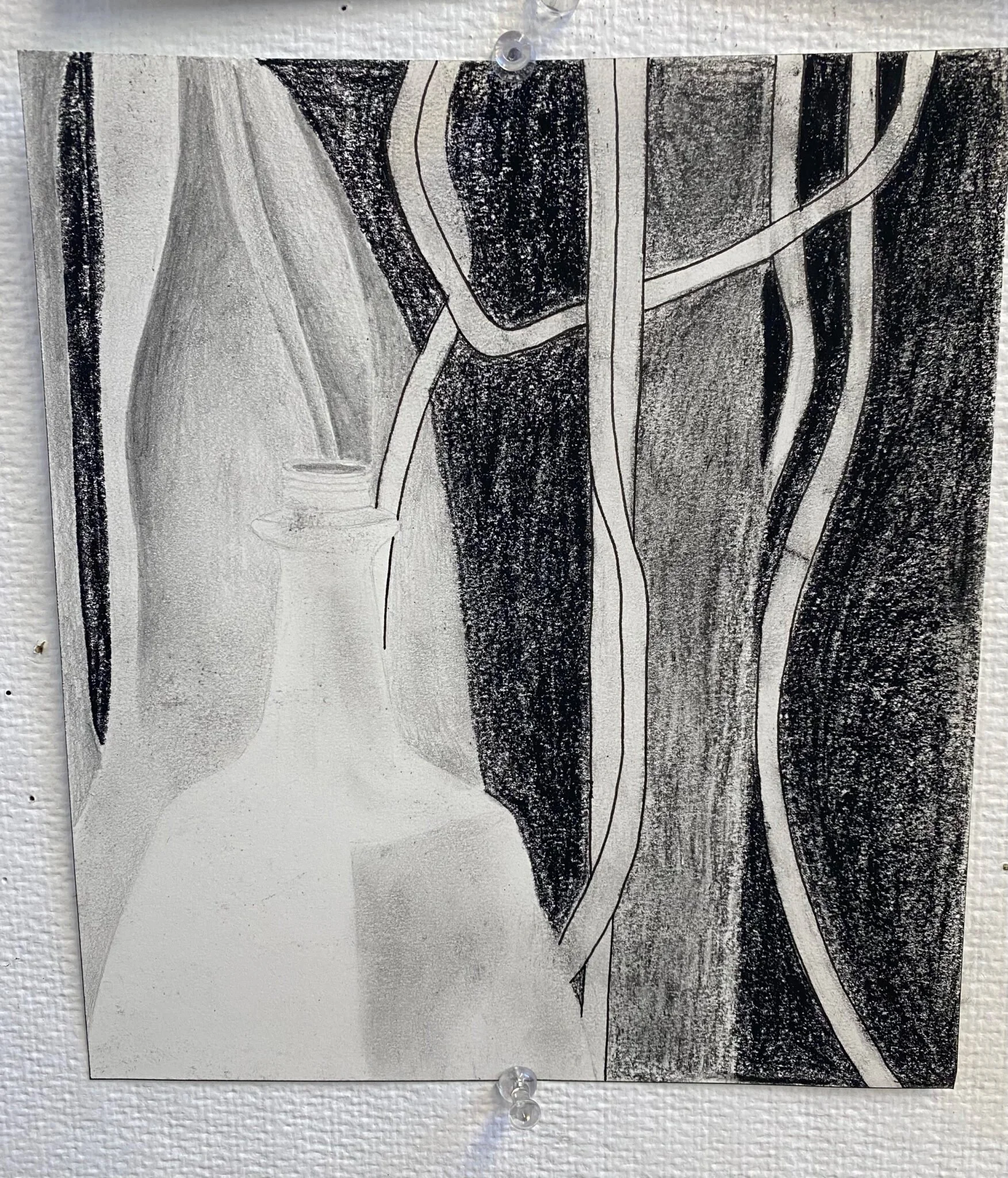
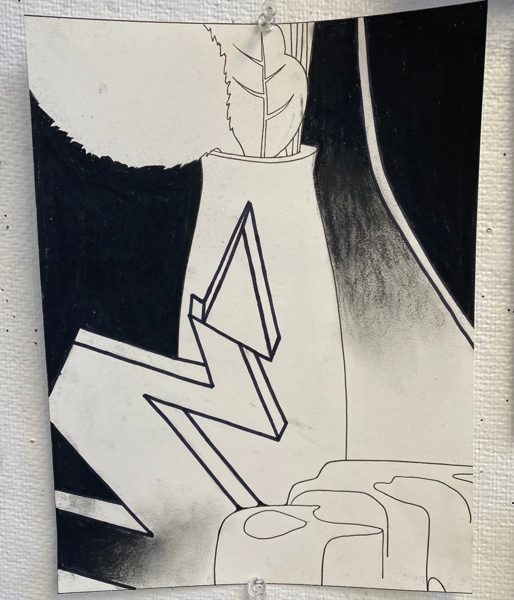
This assignment challenged me to make the most of ALL of my materials. My approach to this project was to focus on practicing strong contrast. I admit, I started off my drawing using a lot of graphite pencil, but I soon realized how other materials made it easier to add more contrast. Compressed charcoal for example made creating the dark background in my first image a lot easier and smoother. On the other hand the compressed charcoal was also very messy and made it hard to reduce smearing. Vine charcoal was another favorite of mine. I loved how easily it blended, but had problems building it for more contrast. Perhaps I need more practice with that.
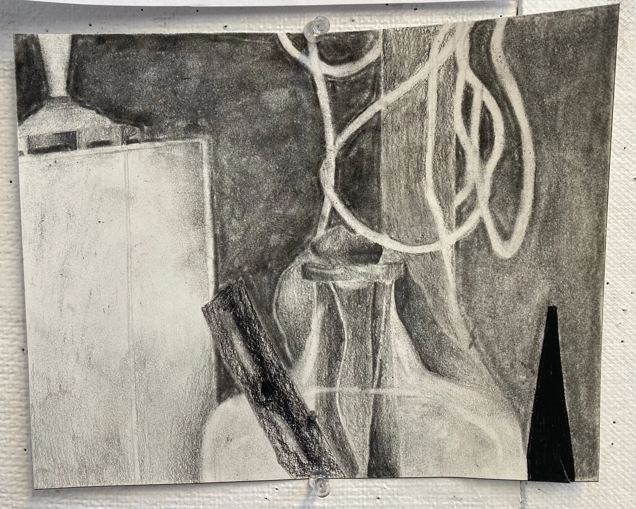
Out of the four drawings, my favorite was drawing number 1. I enjoy this one the most because it has so much contrast with the black background and lighter shaded objects. The contrast really makes the items in the image pop out of the page. I believe my least successful image was drawing number 4. I think this image was not very engaging. This was the image I tried to keep black and white, but I don’t think there was enough exchange between the two shades. In the future I hope to work on using and blending more materials together while also making a strong contrast throughout the image. To do this I hope to work with more compressed charcoal, charcoal pencil, vine charcoal, and graphite pencil.
